When someone is living with dementia, the world can sometimes feel more confusing, overwhelming, or tiring than it used to.
In moments like these, small things in the environment can matter more than we expect — and color is one of those small things.
The colors in a room, on a curtain, on a blanket, on a tablecloth, or even on a simple activity page can shape how a space feels: calm or busy, comforting or distracting, easy to rest in or harder to settle into.
There is no single “perfect” color palette for every person. But gentle, thoughtful color choices can help create a more supportive atmosphere for quiet time, everyday routines, and visits together.
In this post, I’m sharing a few simple ideas for using color in a more dementia-friendly way — in a home, a care setting, or anywhere you want to create a calmer feeling.
1. Why color can feel especially important in dementia care
Dementia can affect the way a person processes information, including visual information. A room that feels normal to one person may feel too busy, too bright, or difficult to read to someone else.
That’s one reason color can matter in daily life.
Gentle color choices may help:
- a room feel calmer
- reduce visual stress
- make some everyday items easier to notice
- support comfort during visits or quiet activities
Color is not a cure, of course — but it can be one small, meaningful part of a more supportive environment.
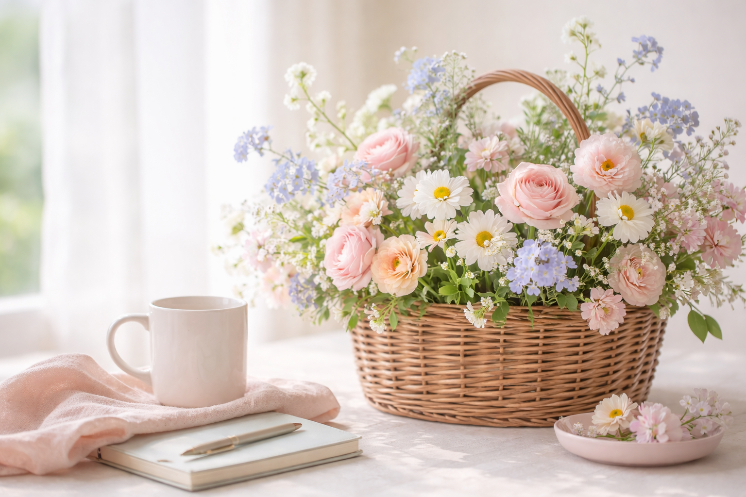
2. Gentle, calming colors that often feel easier to live with
Many caregivers notice that soft, muted colors feel easier during stressful or tiring days.
Some often-comforting choices include:
- soft blues
- muted greens
- warm neutrals (cream, beige, soft taupe)
- dusty rose / soft blush
- gentle lavender
- warm light gray (not too cool)
These kinds of shades can make a space feel:
- less visually “loud”
- more restful
- easier to stay in for longer periods
- comforting during quiet moments
A gentle reminder: familiarity matters too
What feels calming is very personal.
For one person, a warm peach tone may feel comforting because it reminds them of a familiar room or a favorite blanket. For someone else, soft blue may feel more peaceful.
In dementia care, familiar and comforting often matters more than “perfect design.”
3. Colors and patterns that may feel overwhelming in some spaces
This doesn’t mean bright colors are bad. Bright colors can be joyful, meaningful, and helpful in the right place.
But in spaces meant for rest or calm, too much visual intensity can sometimes feel overstimulating.
It may help to use less of:
- harsh, high-contrast color combinations
- neon tones
- very busy multicolor patterns
- shiny or reflective surfaces that create visual “noise”
If a room already feels a little busy, even one small change — like a calmer curtain, a plain blanket, or a less patterned tablecloth — can sometimes make a noticeable difference.
4. Easy ways to bring in calming color (without redecorating everything)
You don’t need to redo an entire room.
Small changes can still help create a gentler atmosphere.
Simple places to start
- blankets or throws
- cushion covers
- curtains
- bed linens
- placemats or tablecloths
- favorite mugs or cups
- storage baskets
- printable activities and coloring pages
A more consistent, gentle palette in everyday items can make a space feel less visually tiring — and often more comforting.
5. Color can also support connection during visits
Color is not only about decoration. It can also support emotional comfort and connection.
For example:
- a familiar floral pattern in soft colors may spark a memory
- a favorite colored mug may feel grounding
- a gentle coloring page may make it easier to spend quiet time together
- a calm visual setting can make visits feel less pressured
Sometimes conversation flows. Sometimes it doesn’t.
A calm activity and a calmer environment can help make “being together” feel easier, even when words are hard.
6. Gentle coloring pages as a calm, low-pressure activity
Coloring is not just for children. For many seniors (including people living with dementia), simple coloring pages can offer:
- a gentle focus
- a quiet rhythm
- less pressure than conversation
- a shared activity during visits
What often helps most:
- large-print / large shapes
- simple designs
- clear outlines
- less clutter on the page
- no pressure to finish
If you’d like a gentle place to start, I have a few free printable options in my freebies library:
And if you’re looking for more printable coloring pages in the same calm, simple style, I also make a few senior-friendly options in my Etsy shop:
- Large Print Coloring Pages for Seniors (Printable PDF)
- Animals & Pets Mini Coloring Set (Senior-Friendly, Large Print)
- Kitchen & Food Mini Coloring Set (Senior-Friendly, Large Print)
(These are designed to be simple, gentle, and easy to use for quiet moments — not perfect results.)
7. A gentle way to test what feels best
If you’re not sure which colors feel most comfortable, try a simple “one small change” approach:
- Change one small thing (for example, a blanket, cushion cover, or activity page)
- Notice how the room feels for a few days
- Keep what feels calmer, easier, or more comforting
No pressure. No perfect palette needed.
In dementia care, the goal is not perfection — it’s comfort, support, and connection.
Final thoughts
The colors around us can’t remove every hard moment, but they can shape the feeling of a room.
And sometimes, a calmer room helps create a calmer moment.
Small, simple supports matter.
If you’re a caregiver, family member, or activity coordinator, I hope this gives you one or two gentle ideas to try. You don’t need to change everything at once — even small shifts can help.
Leave a Reply